The Power of a Brand Identity
Symbols, wordmarks, logotypes, badges or icons. Call them what you like, but a company’s brand identity is usually the first visual touch point for any consumer or business audience. And it’s this identity, when viewed, that starts to trigger any gut feelings you might have about that brand, or starts to communicate the personality before you’ve even decided to engage with its services, or purchase its products.
After all the research, auditing, brand workshops, positioning, strategy and the important copywriting phases have been completed, the identity is usually the first piece of creativity a brand designer will look at when starting a project. And although the final output can sometimes looks quite effortless, the work beforehand with all the information gathering, mood boards and initial sketches to get it there, can be quite arduous. There’s usually a lot of head scratching, idea generating and cutting room floor moments, but ultimately, the joy of creating a perfectly crafted symbol or word mark can be rewarding.
Over the years at Absolute, we’ve been involved in quite a number of interesting brand projects. Some companies we’ve collaborated with required a complete brand overall, others were more keen on a development of the existing brand; whilst a few new business start-ups required creating something completely fresh. Each one going through the same process, but each one wanting different levels of detail.
No matter which path a client takes with their brand, there are always two things that remain constant; what does the identity say to the audience and what does it look like when applied to the different brand touch points?
Here’s a selection of brand identities we’ve created for our clients and a bit of background information on how we got the idea. Each one has been stripped back to the moment when we crafted the shapes and typography, but had not quite chosen the colour treatments for application. In days gone by, this version would be the “what does the logo look like in black and white for a newspaper advert?”.
Intelligent branding
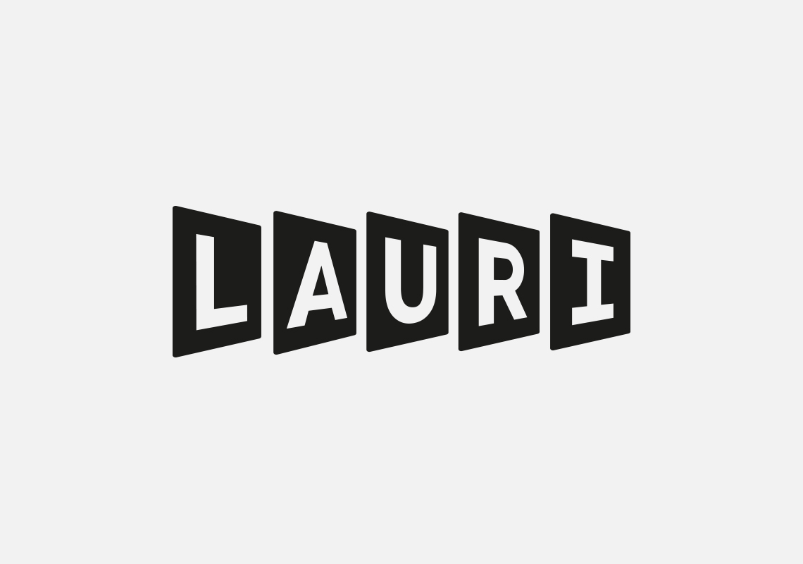
After one of our Absolute Clarity naming workshop sessions, we created a completely new brand identity for Keoghs A.I. product. Lauri was the name given, which conveniently included the letters ‘AI’ in the five letters. Its main selling point was that Lauri could analyse and process data in a fraction of the time it took a team of people to. Impressive eh? This knowledge of the product led to the creation of our document shaped identity, which looks even better animated to convey the speed.
Box clever and box power
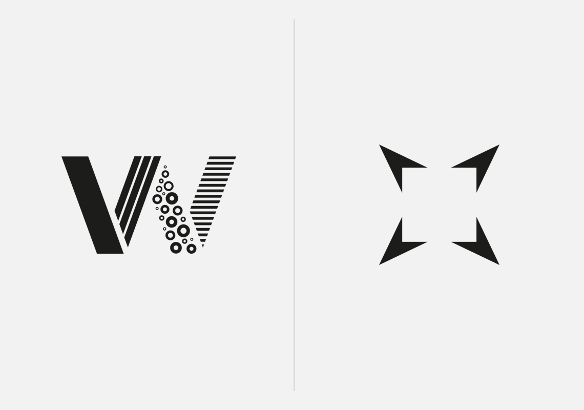
Sometimes clients think that a company name change will help them alter the perception of their brand. In Wessex Packaging’s case, they wanted to look and sound more like a UK wide service rather than just a regional packaging company, which is what the existing name suggested. A brand workshop was conducted, client audits were completed and new names were generated, but most interestingly, what came out of the research was that Wessex and their clients weren’t aligned in their perceptions. This resulted in shortening the name, which had great brand equity and customer loyalty, then repositioning the personality of the company to match customer expectations. The name didn’t suggest what they did, but the new identity clearly does. Clever packaging people.
Our lead image was created for a company whose interest is in the community it serves. Box Power is a business energy consultant like no other, not here to make money, but here to make a real difference. Their profits all going to the charities they represent. The symbol we created for them literally visualises the name of the company in a powerful way.
A play on words
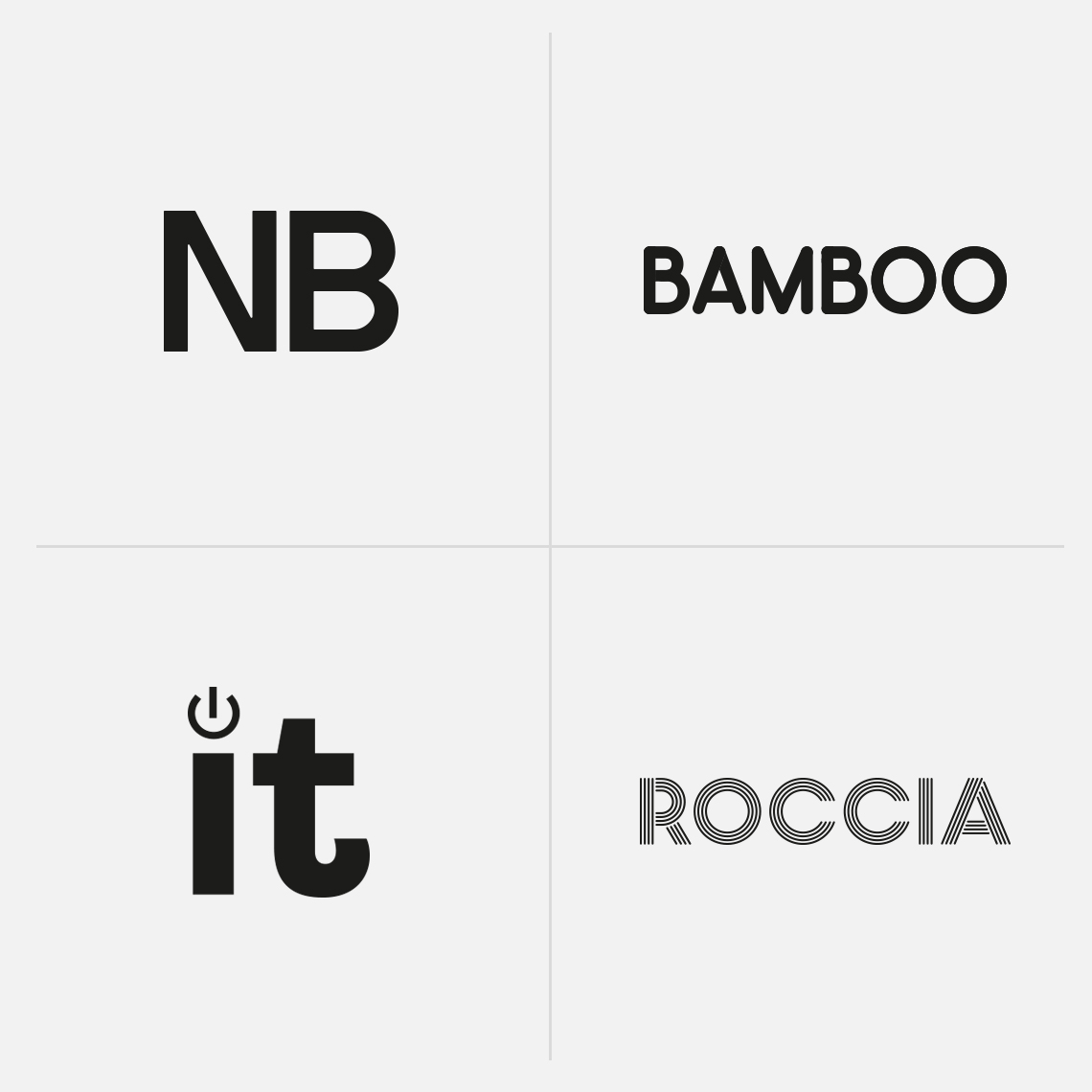
Identities don’t always have an icon or symbol to communicate what a company does or sells, so sometimes a different approach is required. Take NB Colour Print Ltd. Yes, they’re a local colour printer and yes, they’ve got bags of personality, but their existing identity was a little bit over complicated and didn’t really say much about them. Cue a new bold and colourful typographic approach that clearly communicates their colourful personality. No Bullshit.
Bamboo’s new word mark needed to be kept simple, because the brands personality was mainly conveyed through its warm, friendly and approachable new panda, Boo. So we created a new rounded typeface made out of bamboo shoots to compliment our animated character. You really do get a Boo from Bamboo.
Our next door neighbours, Clever IT, had been stuck with an existing brand that definitely didn’t match their brilliant service and potential new customers who really didn’t understand what ‘IT’ was really all about. A new playful typographic approach that plays on the ‘IT’ was needed. The cherry on top was to make sure their customers knew that they ‘Were on it’.
Tile Mart sounded like a budget tile shop. This wasn’t the case if you ever visited one of their tile showrooms, so perceptions needed altering. One naming workshop later, one new word mark made from a tile cement applicator and one swift move in repositioning, we firmly placed Roccia where they should be.
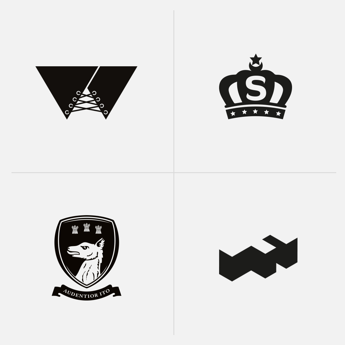
Basques, crowns, hunting dogs and building blocks
We certainly enjoy variety with all of our branding projects. No matter what sector our clients are in or what their company offers, we still apply the same great thinking to every branding project.
Every now and again we get the opportunity to work with clients who are a little bit more risqué than others. None more so than The Wam Bam Club, a burlesque supper club based in London. A digital project that also needed a bit of rebranding and repositioning to communicate its point of difference. Out went the old identity and website. Out came the basque. And out came a ‘Feast of fantasy’.
The crown definitely came out when we rebranded Sultan, The King of Doner. A brand fit for Ottoman royalty, and a Turkish food company based in Bolton.
History also played the part when we reinvigorated the school crest for Abbeygate College, a co-educational school based in Saighton Grange, Chester. The area dates back to roman times and the crest contains a medieval hunting dog, three bails of hay and ‘Audentior Ito’ translated from latin meaning ‘to proceed boldly’. A simple brief to contain all these essential elements, but quite a few iterations to make sure the crest looked finely balanced.
The brief from Forshaw Land & Property was to build the brand. We took this literally and designed an isometric typographic symbol. Definitely something to build on.
Me, myself and Clive
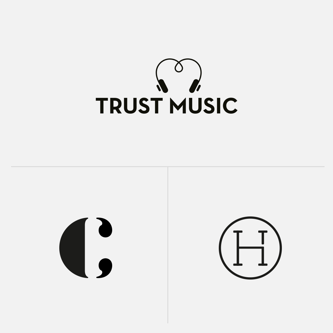
It’s not often you get to go back to your old high school, but I did when Bolton based music charity Trust Music came to Absolute. The charity was set up to create an inclusive environment for all children regardless of their background, using music to give them a genuine feeling of belonging. The venue for the photography shoot was at the same place the charity hold music sessions; Ladybridge High (formerly Deane High). A nostalgic trip back in time, and an identity to communicate the ‘Put your heart into music’ message.
Whilst working with clients on projects, occasionally they might like to shoehorn a personal project in. Usually this is done in a ‘I’m setting up a business myself’ kind of way. House of Thobes was the name of the venture, and a neat little clothing label symbol was fashioned from three initials.
And finally, Clive Steeper, who is a good friend of our MD Chris, wanted an identity that communicated the fact he’s a great motivational speaker. We think the symbol we created does this in quite a clever and simple way.