
Linking navigation patterns with user experience
What is the first thing you do when you land on a website? This is probably an impossible question to answer without knowing why you’re viewing it or how you came to be there.
Navigation, or “the nav”, can often be a sticking point with a client when analyzing proposed designs. The problem with “the nav” is that it is a singular term when website navigation needs to be provided in multiple forms and patterns.
When I posed the initial question about the hypothetical website above, perhaps you may have thought, “not sure, I may have a look at the nav to see where I can go”. The nav offers visitors somewhere to look at times when they are looking for something specific, or as a last resort when nothing more relevant has caught their attention elsewhere on any given page. In our case, it may have been the latter as we are unaware of what else is on this hypothetical website and want to form a clearer picture by looking at the navigation structure.
It is often the minority of visitors who arrive on a website looking for one specific thing. They may visit because they want a general overview of the website’s content or because it is relevant to something they are interested in. One persona for a common visitor to a website such as BBC Sport is the general sports-enthusiast looking to catch up on the latest headlines to make sure they’re not missing any big stories. Another persona, this time looking at the website of a higher education institute, is the budding student who is in the process of comparing a few different options available to them.
In both of these cases, the nav is unlikely to be their first port of call. The former should find the biggest and latest stories at first glance and should they click through to one in particular, accompanying that article they will also find two lists directing them to other top and related stories. Meanwhile, the budding student is likely to explore the website to gain an overview as they go by digesting page content and following any links that pique their interest.
Neither persona has interacted with the main navigation, yet they are both navigating the website. It could therefore be said that the primary form of navigation on a website is the content itself, while what we currently refer to as the main navigation is a secondary function offered to assist them when required. This is further evidence as to why well considered, good quality content is paramount to the success of a website. Your content can allow you to shape the user’s journey through your website, leading them to important content relevant to the path they follow from start to finish.
What this does is removes the paradox of choice, which is the idea that more choice is a positive in terms of empowerment and freedom but also a negative in that it causes confusion and anxiety if the number of options becomes overwhelming. By leading visitors on a user journey through content, decisions remain simple and contextual while further choices remain behind the so-called main navigation, should it be required.
Tips for usable navigation
Function over form – The understandability and ease of use of your navigation should be priority over how it appears on your site. This is especially true for more complex navigation structures when the site architecture sits across a large number of levels meaning the more minimal and aesthetically pleasing navigation patterns may be harder to achieve. That’s not to say a complex structure can’t be well-designed and look good, but the usability of it shouldn’t be compromised just to look a certain way – perhaps like something you’ve seen done elsewhere.
Consistency across devices – Consistency is a fundamental component of responsive web design and if you can offer as similar an experience of navigating your website across devices, this will ensure familiarity for your returning visitors who may be viewing on their desktop at work, their tablet in front of the television at home and their mobile while waiting in the queue at Starbucks. Having to contend with different navigation patterns from one device to another increases the learning curve of using your website.
Hierarchy should be inherent – Context is very important in allowing visitors to understand the content they are viewing. Being able to see a clear hierarchy will assist them in forming relationships between the content they are viewing when navigating from one page to the next.
Accurate and descriptive links – Even if you nail all other aspects when setting out your website navigation, if the destinations of each link aren’t clear and apparent to your visitors then they are likely to become confused and lost. Consider your audience and choose a style and tone of voice that, first and foremost will be identifiable to them.
Common navigation patterns
The truth is that there is no single navigation pattern that will suit every website as the architecture and audience is different for each. With responsive web design to consider now with such a variety of devices in use, it is also a much more complicated challenge. So to help evaluate what may be best for you we have detailed some common navigation patterns below, stating why and where they might be used.
Inline lists
Goal – Simplistic layout that generally aims to keep navigation condensed while allowing it to sit within a header across the top of every page.
When to use – Ideal for use on websites with a shallow architecture that only have three to five top-level items, any more than this can make it difficult to maintain a consistent responsive solution.
Example – www.apple.com

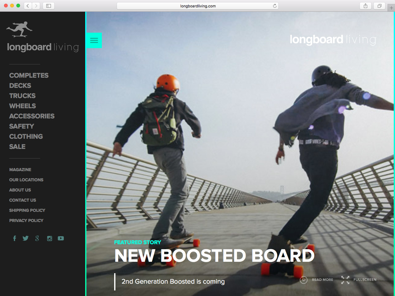
Vertical lists
Goal – A variation on the inline list where, unsurprisingly, items are stacked vertically instead.
When to use – Similar to an inline list but can handle a few more top level items and is easier to maintain across devices because width is more of limiting factor than height.
Example – www.longboardliving.com
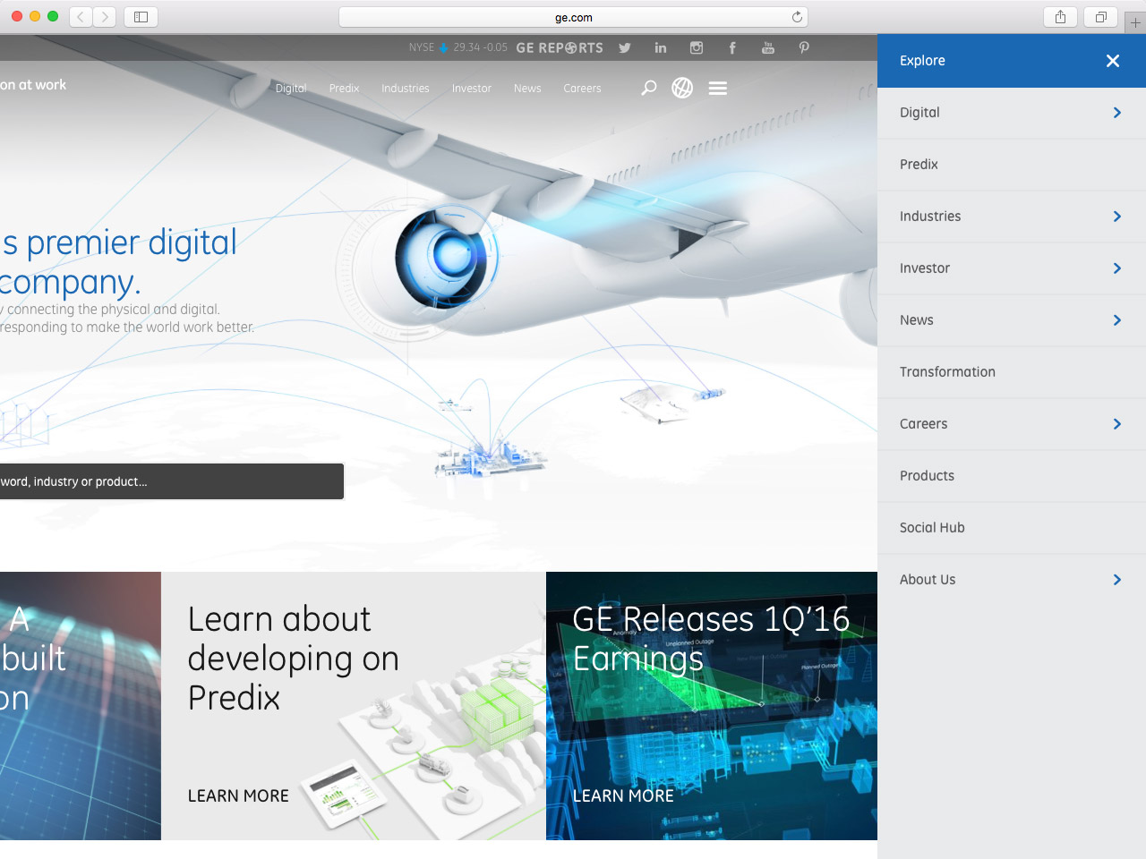
Off-canvas / hamburger menu
Goal – More controversial than most, the off-canvas menu sees navigation items sit off screen and out of view, only to be revealed at the press of a menu button that is often disguised as the three bar icon said to resemble a hamburger.
When to use – Being seen as a modern trend from the mobile revolution, this pattern is used on a variety of very different websites. It is commonly used for maintaining a minimal aesthetic but in terms of function is particularly useful for presenting a large number of navigation items consistently across devices.
Example – www.ge.com
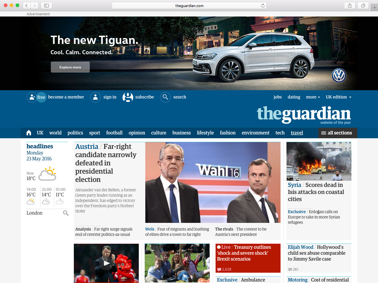
Priority+
Goal – A bit of an adaptation to the off-canvas menu, the Priority+ pattern requires ordering navigation items by their importance and aims to keep as much of them in view as possible before grouping the remainder under some sort of “more” or “all” option.
When to use – Useful on websites with a wide site architecture containing a few key areas that are easily identifiable as more important than the others. If importance is fairly balanced across the board then this one could be difficult to plan. Implementing a multi-level solution could be more difficult than with the off-canvas menu.
Example – www.theguardian.com/uk
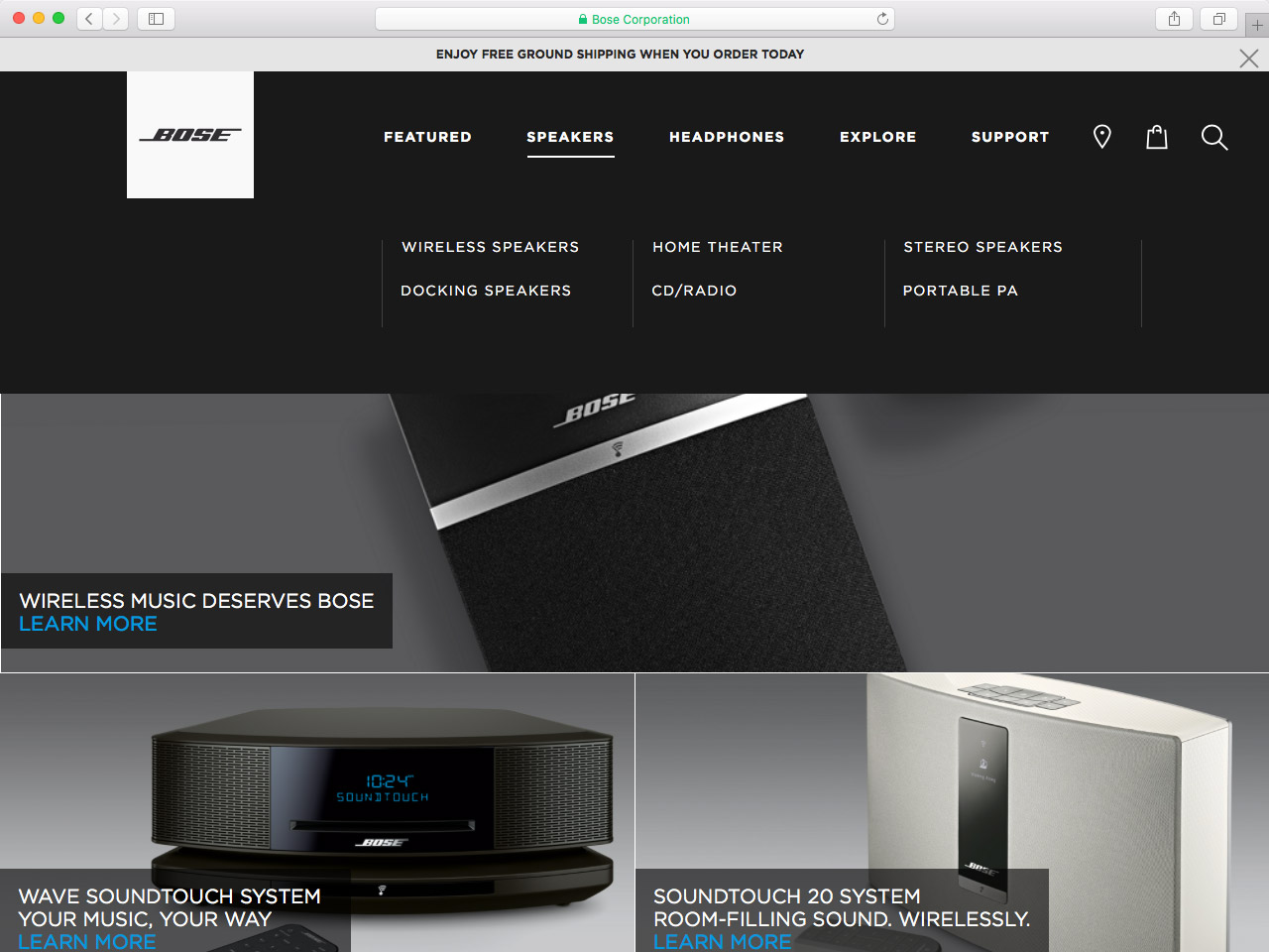
Drop down / rollover
Goal – Regularly using the inline list as a starting point, this pattern reveals further levels as a dropdown, often through a hover interaction.
When to use – The emergence of mobile usage and responsive web design has seen this pattern become much less common as hover is a difficult interaction to recreate on touch devices. However, with Apple’s developing technology of 3D touch this is a pattern that could yet make a comeback – but there would be work to do as it remains relatively unexplored on smaller devices.
Example – www.bose.com
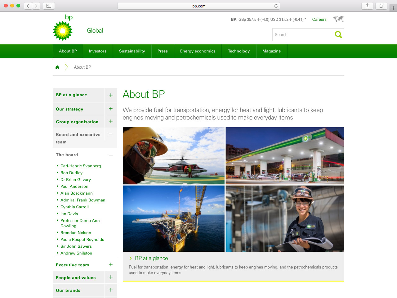
Tabs / accordion
Goal – Tabs or accordions allow users to toggle between clearly defined sections without being overwhelmed by all information at once.
When to use – Often used to group large bodies of bottom-level content on a single page, tabs or accordions can also be used to group multi-level navigation items in a similar way to prevent an overload of choice.
Example – www.bp.com
Breadcrumbs
Goal – Provide a vertical linking structure so users can navigate backwards as well as forwards, while providing a visual representation of where they are within the website.
When to use – Useful on websites with a deep information architecture that spans across a number of levels.
Example – www.manchester.ac.uk

Conclusion
Hopefully this overview has helped you to consider what navigation pattern may be the best suited to your website and will kick off the thought process on how creating guided user journeys can help visitors navigate your website.